2021 Bullet Journal Set-Up

Hey guys! Hope you all had an amazing holiday!! I’m really excited for today’s post because it’s my 2021 BULLET JOURNAL SET-UP!!!!! I received a new bullet journal for Christmas and had so much fun creating my spreads for the new year. Opening up a new journal is always so satisfying, and I can’t wait for the fresh start that this journal is going to help me with in 2021✨

If this is your first year bullet journaling, a bullet journal is basically a planner, diary, mood and habit tracker and scrapbook all in one! I go a bit more in depth about what bullet journaling is all about in my very first set-up in 2018, and I also have a whole post on How I Use My Bullet Journal which is very helpful if you’re just starting, so be sure to check those out:) Plus, if you’re looking for more inspiration make sure to take a look at my 2019 and 2020 set-ups as well:))

This year I’m using a Leuchtturm 1917 journal for the third time because I really love the quality; it’s hardcover, has numbered pages, a pocket at the back, and it’s not too expensive! This is also the only journal I can find that has at least 240 pages. I like to give myself 20 pages per month and be able to fit the whole year in one journal, so the amount of pages in the Leuchtturm 1917 is great🙌 For 2021 I chose their Lemon yellow colour🥰 It’s pretty bright, but yellow is one of my favourite colours and I thought that it would bring some positive vibes into this year which we all need!

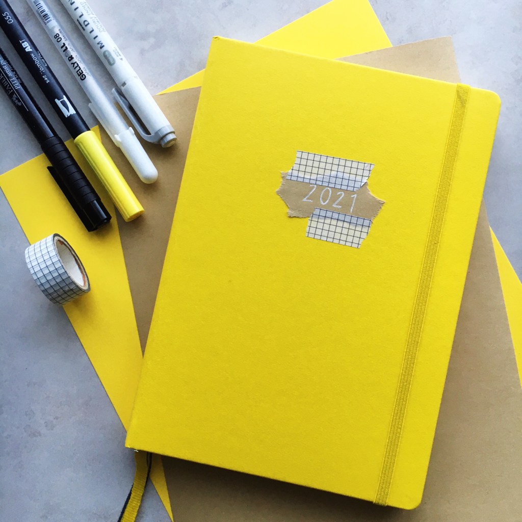
I know that lots of people like to keep their beginning-of-the-year spreads pretty neutral, but last year I brought in some olive green because my journal was an olive green colour, and it looked really good. So this year I decided to use some yellow in my 2021 set-up and I love how it turned out!! I paired it with a nice light grey. Actually yellow and grey are two of the Pantone colours of the year as well, so look at me go! As is hinted at by the cover of my journal, I used a lot of brown kraft paper in these spreads as well, and wrote over it with a white gel pen. I got a whole roll of this stuff on Amazon for like five bucks and it was TOTALLY worth it- it looks so good! And then I also used some washi tape because the one I have is neutral and it’s a great way to fill in empty space. The markers I used throughout this spread were a bright yellow Tombow Dual Brush Pen in the shade 055, a light grey Zebra Mildliner, my Faber Castell fineliners, and my Sakura Gelly Roll 08 gel pen.

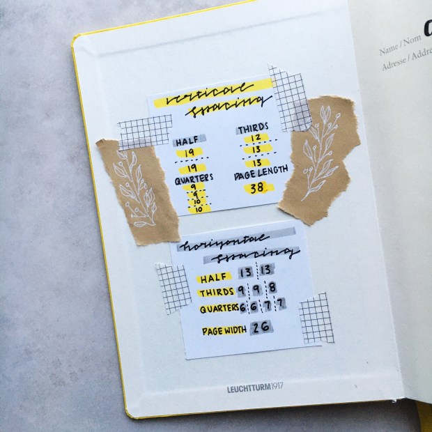
On the inside cover I glued in some simple little spacing cheat sheets. These are great for when I’m making any sort of spread and need to know how to divide up the page without doing the math or counting every single time. There are some great resources on how to use a whole page to make a more elaborate cheat sheet; I love AmandaRachLee on Youtube! But I like this simple and I don’t feel like I need to use up a whole page for it. I decorated with a cute little olive branch motif on that brown kraft paper, which is something you’ll see me use a lot throughout this set-up!

Then on the opposite page I wrote out my name and contact info, and a little quote/personal motto:)

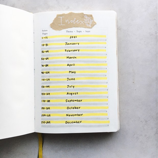
This journal also comes with a pre-made index, which is really nice! I don’t keep track of every single page in my journal, but I did write out which pages I’m using for which months. I wrote out my own title, and I love the way that the yellow and grey work together! There is still some space on those grey lines to keep track of more spreads if I want to. There were two more pages that had indexes on them, but I think I’ll just either glue those together or leave them blank.

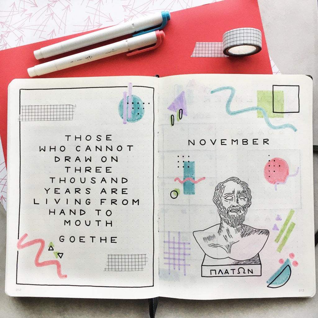
Here’s page 1 in my journal! I did a nice 2021 title page with a border of kraft paper that has some of those olive branch doodles on it. I wrote out 2021 in a simple, yellow font, and then actually wrote out the words twenty twenty-one as well. On the opposite page there’s my key. I pretty much kept the same key as last year because I found that it works really well for me! But there are so many options that you can use when it comes to bullet shapes and pen colours to differentiate between tasks and keep you organized. I used a stencil to draw out a key on that kraft paper for decoration as well.

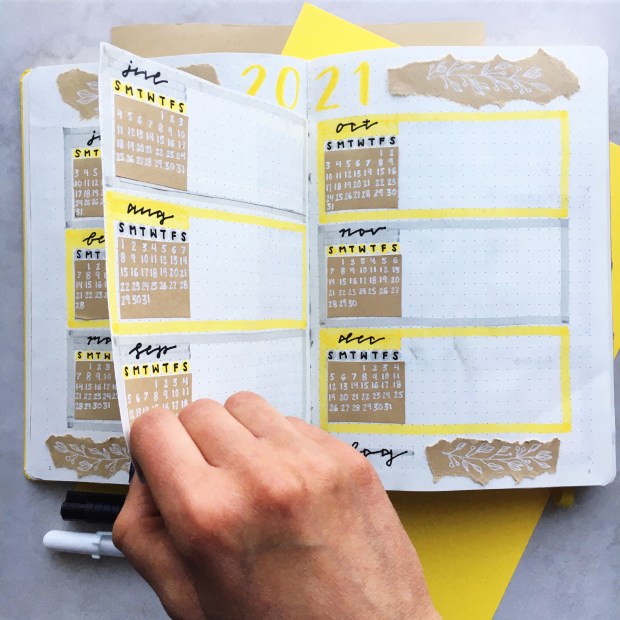
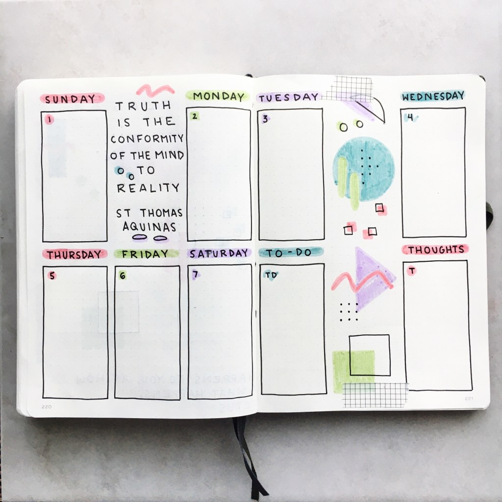
This next spread is my future log! This is where I write down all the events that are coming up for the year; like birthdays, future appointments, or exam dates. The little calendars I drew out are also helpful when I’m setting up my monthly spreads. This year I was inspired by AmandaRachLee to try something really cool. I cut the edges of the page in between two spreads so that it’s like a little door that you can flip back and forth. This way you only have to write out one title, and it also makes the whole thing feel more cohesive because instead of splitting this between two spreads, it’s like it’s only one spread. I used kraft paper for those olive branch doodles, and also to write out the calendars. This spread is super functional and super cute- which is great combo when it comes to bullet journaling!

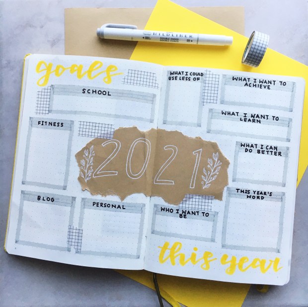
Next up is my goals/”this year” spread. I drew out a big 2021 in the centre on kraft paper, which I LOVE. On the left side I have some boxes to write down my goals for the year, which I split into school, fitness, blog and personal. Then on the right I have a space to do a bit of journaling before the year begins. I wrote some prompts that will help me to get focused on what I want to achieve this year. It’s great to have some goals to work on over the course of the year- whether you’re using a bullet journal or not. I love these pages so much and can’t wait to fill them in!

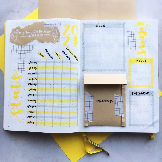
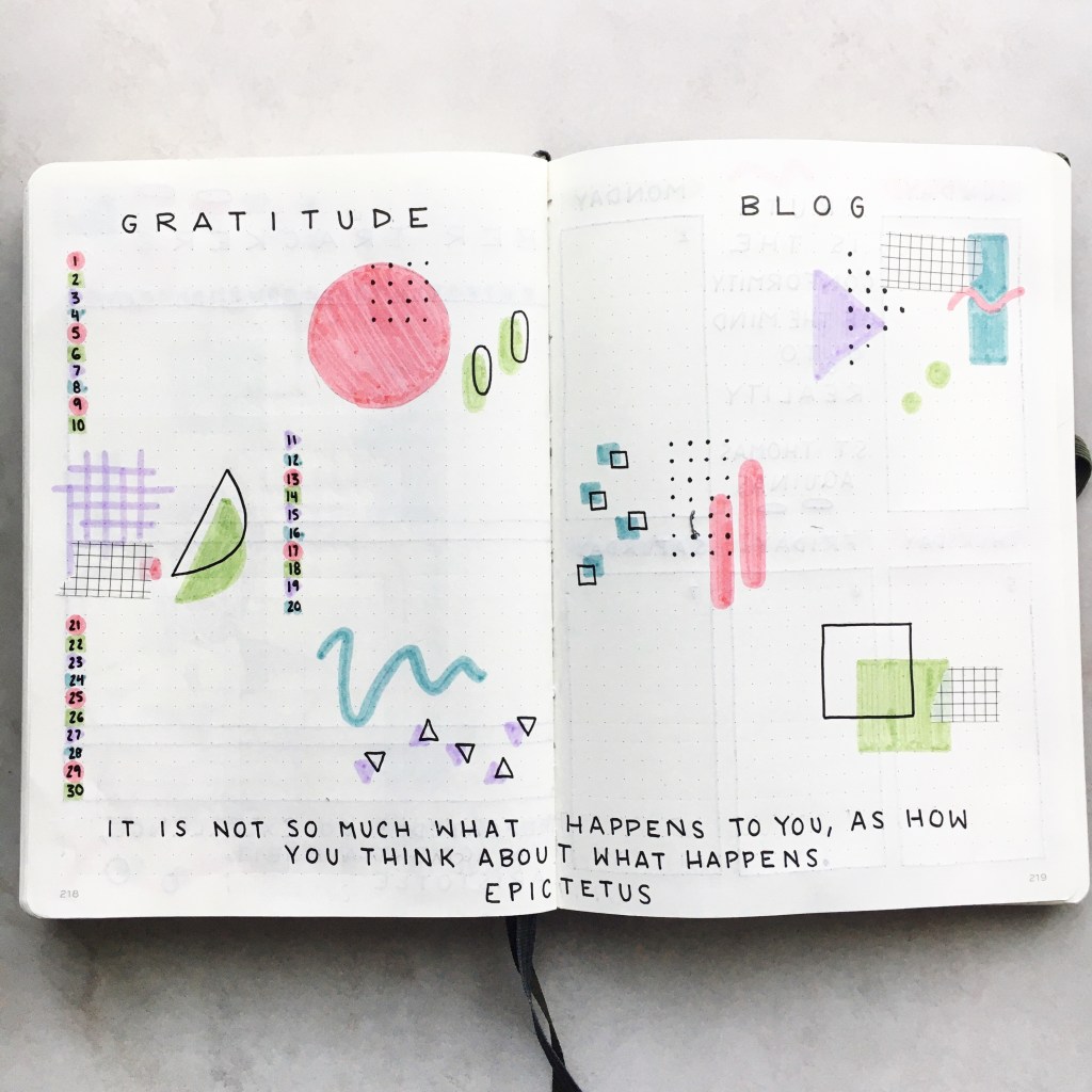
This spread took me a while to figure out because I knew that I wanted some sort of blogging spread at the beginning of my journal, but just didn’t know what that would look like. But now that I’m finished I’m so so happy with the way that this looks! I wrote out “My Day Is Booked Dashboard” on that kraft paper and used it as a tile, and then wrote 2021 in yellow beside that. Beneath the title on the left page, I have a chart where I can track all of my blog and Instagram stats. Last year I tracked these monthly in my monthly recaps, but because I was often behind on those monthly recaps I couldn’t get an accurate count of my Instagram growth. So this will allow me to write down everything right away. Then on the next page I have lots of space to write down both blog and Instagram ideas, and I made such a cute little envelope out of my kraft paper to hold any extra notes that I might have! Maybe I’ll do a tutorial on Instagram reels on how to make one! I’ll write that down in my ideas section:) Even if you don’t have a blog, a page like this can still be very helpful for work or school. Make it your own!

These are the last two pages of my set-up:) Of course I had to include a 2021 reading challenge- I enjoyed the one I did last year so much! I’ll have a whole other post dedicated to this coming out soon. Then on the opposite page I wrote out a quote, because I love to have one to start off the year. My quote this year is “What the New Year brings to you depends a lot on what you bring to the New Year.” This really resonated with me because it reminds me that it’s important to have a positive attitude, work hard and give it your all! I did another of those kraft paper borders to surround this page.

And that concludes my 2021 Set-Up!! I’m so excited to fill all of these spreads in, and I love how they make me feel ready to take on the world in 2021. I hope that you found some inspiration in this post and that you have fun setting up your own journal! Don’t forget to check out my past set-ups if you want to see more spread ideas, and feel free to ask me any questions you have about bullet journaling! Stay tuned for my January 2021 Set-Up coming up soon:))

Yours Truly,

Olivia:))

November 2020 Bullet Journal Set-Up

Hey guys! October is coming to an end which is sad because my black and white moon theme was SO dramatic, simple and fun to do. I’m going to miss it✨ For November I’m doing something kind of different as well though, so it should be interesting!

I recently finished reading Sophie’s World (it was on my October Reading List, go check it out👍), which is a novel all about the history of mostly western philosophy. Anyways I really liked it; it makes you think about questions that you never really tackle in day to day life. Definitely recommend👌 It inspired me to do sort of a philosophy/abstract art/geometric/doodley theme for November😂 This may be a lot to take in. Let me explain.

At first I was just trying to figure out how to do a philosophy theme, like which doodles to do and stuff. And then I drew a bust of Plato on the front page, and was looking at how to draw those doodles around him, because I can’t just draw busts for the whole month because they take me forever😂 But instead of drawing philosophical doodles, I just ended up doing a bunch of geometric shapes. I was inspired by that kind of 80s pattern with all the dots and squiggles and different things like that:

So my final theme kind of reminds me of modern or abstract art, which I think is super cool! I’m definitely keeping that philosophy undertone with a bunch of busts and philosophical quotes though👌

Not gonna lie, I’m very surprised and proud of how my busts turned out. Usually I CANNOT draw people to save my life, so this was kind of an anomaly that you probably won’t see again😂😂 I hope you guys like these spreads and can draw some inspo from them! Even if you don’t want to draw the busts, just the shapes by themselves is a fun theme that you can play around with. Here’s my set-up!

First is my title page! I have my bust of Plato surrounded by abstract doodles. The colours that I used this month are all Zebra Mildliners, and I used this reddish-pink colour, a blue, a light green, and a purple. They’re all kind of the same saturation and I think they work well together:) I have my quote page on the opposite side as usual, and I also used my grid washi tape again this month because I think it fits in with the theme and adds a little something. I’ve actually been using some Faber-Castell black fineliners since my Sakura ones ran out, and I love them! The ink is so black and the sizes are perfect.

After a while of that half-page calendar layout, I finally switched back to this full page one. I feel like this one is just easier to use and plan with, plus you can see everything really easily. I still made room for goals and tasks though, and wrote out another philosophical quote from Socrates. I don’t really know how to describe the font I did this month, but it’s all caps and kind of rounded. I tried to space it out and fill up a whole square with each letter to make it look unique.

On to my trackers! I was brave enough to draw out another bust- Aristotle this time- and then I did more shapes and some more washi tape. As usual I’m tracking lots of habits, mood, productivity and workouts. The quote I have at the bottom is perfect for this spread! “We are what we repeatedly do. Excellence, then, is not an act but a habit.” – Aristotle

Loving my Gratitude Log and Blog planner this month! The shapes are so fun and everything looks very minimalist which is new for me- I like to fill the page lol. Anyways, I only wrote out the numbers once in this spread because I’ll just use the same line each day. I made sure to include a lot of quotes throughout this set-up to keep up the philosophy theme, so there’s another one at the bottom.

And lastly, my first weekly spread of November. Just did some simple boxes, a few doodles, and yet another quote. I also included a thoughts section, because you never know maybe I’ll have some philosophical thoughts that I’ll need to write down.

There’s my set-up for the month! Let me know if you’ve started your November journal yet, and what theme you went with. I’ll see you guys later in the week with some great recipes:) Have a great day!

Yours Truly,

Olivia:))

September 2020 Bullet Journal Set-Up

Summer is coming to a close and it’s already SEPTEMBER. This year is going by so fast. I’m excited for fall though because I get to do a bunch of warm, cinnamony apple and pumpkin recipes, and also curl up with a good book, and do some cool bullet journal themes:) I was racking my brain for some awesome doodles I could do for September, and then I was like, how is it possible that I HAVEN’T DONE AN OWL THEME YET?!!?? Owls are my absolute favourite animal, and make for the perfect September theme. I didn’t want to draw any cutesy, adorable owls though. I found some great inspiration on Pinterest (I’ll show a pic below) for a geometric owl design that’s stunning. I coloured it in with olive green, navy, and gold, and I know I’ve used green and gold a lot this year already but I felt that these colours worked really well together and were sort of autumn-ish. It’s funny to see how far I’ve come because I was looking through my first ever journal from 2018 and literally all my weekly spreads were the same each month lol. Even last year I feel like I would’ve freaked the heck out if I used the same colour twice. Now I kind of just go with the flow and do whatever I want and it turns out way prettier:))

Back to my September spreads. They’re pretty simple, and I’m doing a lot of quotes and deep, meaningful stuff this month because I feel like I need a boost with going back to school and activities and all that. I really like the way it turned out and I think I can do some pretty cool weeklies in the future. This is random but I’m typing this on my computer and I really want to use emojis and I can’t:) But if I had to come up with an emoji to summarize this spread I think it would be the fire one. Scroll down and check it out!

Here was my inspo BTW:

I mostly used the kind of neon-y owl on the bottom left, as you can see in my cover page:) It took me a little while to draw, and then I realized it was perfectly centred on the page and I should’ve drawn it slightly up more so that I could write September underneath and it wouldn’t look so cramped at the bottom. But I didn’t feel like re-drawing it so I just left it and it was fine. I did more of a bouncy cursive font this month, with some of the letters a bit smaller than others, which creates more interest. On the opposite page I have a nice, inspiring quote, surrounded by some geometric triangles in the corners. I love this title page because it’s simple and sophisticated and so pretty!!:))

I was debating whether I should do a full calendar layout this month since I’ll be busier, or stick with the half page ones I’ve been doing, and I went with the half page. I’ll have more room to write down events and school stuff this way, so we’ll see how it works out. I might end up putting little dots in the calendar boxes, with the colour corresponding to the bigger boxes on the right page, because I won’t have a lot of room to write in the actual calendar. Like if I have an event I’ll do a green dot, and school stuff will be navy dots. That’s confusing but hopefully it kind of makes sense:) These pages are nice and simple as well; I drew a smaller owl over the calendar, and another quote on the right page. Oh I also ended up using my white gel pen to write over the navy, because it shows up better than black and just looks nicer.

My trackers are on point this month! I still love the chart/graph layout; it’s just so easy to use and look at. I find when I use different colours to define my mood I pick ones that are too similar and they all just blend together, but here I can just see everything without to many legends and stuff. This month I’m tracking my habits (I track 12 habits which may seems like a lot but idk I just like to see what I’m doing), mood, productivity and workouts. Then on the side I drew another owl and wrote words that are often associated with them. Love how this spread turned out:)

I decided to include a spot to write down my thoughts each day next to my gratitude log; sort of like a “line a day” thing. I wrote another quote at the bottom of that page, and then did a blog planner, because I think I’ll need it this month. I just have to get better at sitting down each week and filling it out. I made use of those mosaic-y triangles when doing these pages.

Then my first weekly spread:) On the left I have a big quote page. I’ve been into these really long quotes lately, and I like the look of all that writing on a page. Again I was kind of mad about the placement of the owl, because I thought I’d write the quote underneath it but it turned out to be too long. So I wrote it all around the owl, which I feel should’ve been centred but no way was I drawing it again lol. But it turned out nice in the end. Then I have a super simple weekly with lots of space to write down events and stuff that are coming up.

There you go my friends! After this there’s only 3 months left to go in this journal:( I’m so sad because I love this colour, and my very very slight OCD isn’t quite ready to allow me to get the same coloured bujo 2 years in a row. But I’m going to make these last 3 themes awesome so don’t worry:)) Have a great weekend and I’ll see you next week!!

Yours Truly,

Olivia:))

August 2020 Bullet Journal Set-Up

July just flew by, and I’m sad to see my Anne of Green Gables theme go, but I’m absolutely IN LOVE with my theme for August!! At first I was kind of going for a Spanish tile look, but now that I’m done I’m totally getting Mediterranean vibes. I used the fine tip of my light blue Tombow Dual Brush Pen, and a darker blue crayola marker, as well as my gold brush pen from the dollar store, my white Gelly Roll pen, and a finer gold gel pen. I haven’t used my bigger Tombow markers in a while because the brush tip is a little to big for the size of my journal, but the fine tip works perfectly here and I love the colour.

I also didn’t use ANY black in this entire set up and I plan to keep it that way! It just makes it feel really clean and simple and bright, which I love for summer. These spreads are pretty simple in general, cause I wanted a bit of a break from lots of drawing. The tiles are easy to draw because I used the dotted lines as a guide. I also varied the tile sizes a bit to keep things interesting.

I hope you like this month’s set-up and can pull some inspiration from it! I love love love how it turned out and I can’t wait to come up with some more weekly spreads:))

Here’s my title page! I drew 12 tiles that are 8×8 dots each, leaving some space at the top and bottom. It was lots of fun drawing out all these different designs! After I had coloured everything in, I went over the darker blue parts with my white gel pen for some extra detail. Then I wrote August in gold in a simple lowercase font. My quote for this month is “Go bravely, go deeply, or do not go”. While I don’t officially have a focus for this month, I want to make it a priority to give 110% in everything.

Again, I’ve been liking this half page calendar layout a lot! I might have to switch back to a full page one once school stuff starts up again, but for now I’m enjoying this look. I have space for my goals, events, and tasks, and then just my little calendar to write a few important dates down and keep track of what day it is (because when it’s summer AND Covid it’s hard to know). I messed up on my calendar because I forgot that August ends on a Monday and kept drawing circles until the end of the week. But I managed to cover it up by doing some little doodles, and then I did more in the top row too so it looks intentional. And yeah, I drew some smaller tiles here to which I think are so cute:)

My trackers spread is just super clean and simple. I think I’m just going to stick with this horizontal style because I just love the way it looks and how simple it is to fill out. I used a finer gold gel pen to write smaller, because I didn’t want to use black. And then I also have a workout tracker to keep tabs on my fitness.

These pages turned out great and it makes me happy just looking at them!! I did more small tiles for my gratitude log, and bigger tiles over on my blog planner. I haven’t included a blog planner in a while because I wasn’t really using it, but recently I started planning out my posts in advance and it’s helped me a ton, so hopefully I can plan stuff more using this.

And finally, my first weekly spread. Super simple; just some tiles and the first letter of the days of the week. I had another head-smacking moment as I started the week off with Sunday, and then I was like oh shoot, August first is a SATURDAY. I really didn’t want to paste paper on top or mess it up, so I just put Saturday and Sunday together into one box and whatever. I also ended up writing the dates in with my gold gel pen, but it didn’t make it into this photo.

There’s my set up for August!! It’s one of my favourite ones I think; I just love the colours and the simplicity. I had a few little hiccups but it turned out great in the end! Let me know what you think of it and I’ll see you guys Wednesday with another post:)))

Yours Truly,

Olivia:))

June 2020 Bullet Journal Set-Up

Hey guys! I had a bit of a delay but I’m now here with my June 2020 Bullet Journal Set-Up. We’re almost halfway through the year which is crazy! This month I went with a Nancy Drew theme, which is kind of near and dear to my heart. A couple of years ago I read all of my mom’s classic copies, and so I thought it would be a cute theme.

I used yellows and blacks through this month, and also my white gel pen, which I really love. I had some ribbon with keys on it that I was going to use, but it didn’t really fit in anywhere so I left it out. To be honest, when I starting designing the title page I had a but of bullet-journaler’s block, because there are just so many directions that I could’ve gone in, and I couldn’t decide on one! But I finally settled on some cute magnifying glass, flashlight, footprint, and key doodles, as well as some Nancy Drew silhouettes that I traced (because I can’t draw people to save my life).

In the end, I think this theme turned out really well and it was super fun to make! I got to use some card stock and get creative with my trackers, and I put together a weekly spread in a that I’ve never done before. Here it is!

My title page is a little busier than I would’ve liked, but I still think it’s cute. I traced a Nancy Drew silhouette and drew some footprints in black, and then I surrounded the whole thing with doodles. This whole month I’m doing a typewriter font, which fits the theme well and looks great! I could’t resist doing a little cursive on the quote page though. On the opposite page I have a quote from Nancy Drew;))

I went with the same sort of calendar layout that I used in May, because I don’t have a whole lot going on in June either (surprise surprise), so this spread is more efficient. Here I included some more doodles and broke out my white gel pen! I love the card stock that says “Nancy Drew Mystery Stories” in the corner.

Here we have The Case of Olivia’s Habits and Mood! Aka my habit and mood trackers. Again, I used the same layout as last month. I find that these trackers are just really easy to read and look super nice;)) This month I’m tracking some habits, productivity, sleep, and my workouts with the footprints on the side. I used some card stock again cause I love it.

I used some more Nancy-Drew-title-sounding phrases in my next couple pages, because I think it’s super cute. These are my gratitude log and brain dump. I decided to include a brain dump because sometimes I feel like I have things on my mind that I just need to get on paper, especially during this weird time. Anyways, here I can write lists, my thoughts, or anything that I need to articulate.

This weekly spread turned out kind of cool! I love the big letters that spell June in the middle, as well as all of the doodles and the cursive. I left space to write a to-do list and things I have to do for school here as well.

Hopefully these spreads give you some ideas for your own journal! I’ll see you guys on Monday;))

Yours Truly,

Olivia;))