June 2021 Bullet Journal Set-Up

Hey there! I’m back after a bit of an extended leave of absence- I just haven’t been feeling super inspired lately and got off track when it comes to blogging, and actually bullet journaling as well. I started my May set-up but I didn’t have a clear vision for it and was making it WAY too complicated, and it all went downhill from there. So I took a little break from journaling this month, because I just wasn’t feeling it. And it’s all good; even though it bugs me a bit that I now have a month missing, I have some extra pages to play around with later:)

I’m excited to come back to my journal though and I love my June spread! I tried to keep the doodles simple so I can just quickly make weekly spreads and I don’t feel like I’m spending 3772839302 hours bullet journaling each week. Since it’s almost summer time I went with a cherry theme! I absolutely love cherries- they’re one of my favourite fruits, and the bright red and green is such a fun colour palette for some fun summer spreads!

I kept some things the same and changed some things up from previous months, so it’s a good mix of old and new:) Everything looks so cute though and I can’t wait to fill out all of these spreads! Planning definitely helps me feel in control and ready and inspired, and I’ve been missing that the past month. So I’m ready to get back into a routine and kick some butt.

Here’s my journal for the month of June!

Title page first! These cherries were so easy to draw, and I used a bright red and dark red shades of Crayola Super Tips, and my green zebra mildliner. I LOVE LOVE LOVE the font; to give it that hombre look I used an eraser to kind of fade away the bottom of the lettering, and then went over the top half again to make it darker. And I finished it off with some white highlights, which I put on the cherries too- it makes them look so juicy! I did some little sparkles as well to fill up the space.

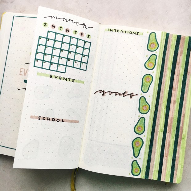
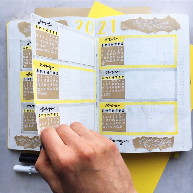
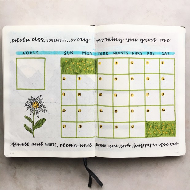
I haven’t done a calendar spread like this for a while, but I think I’ll try it out again. I’m going to use it to plan events and tasks and blog stuff, so that everything is in one place, so hopefully it doesn’t get too full. We’ll see! I also have a goals box and a box to write down the books I read in June.

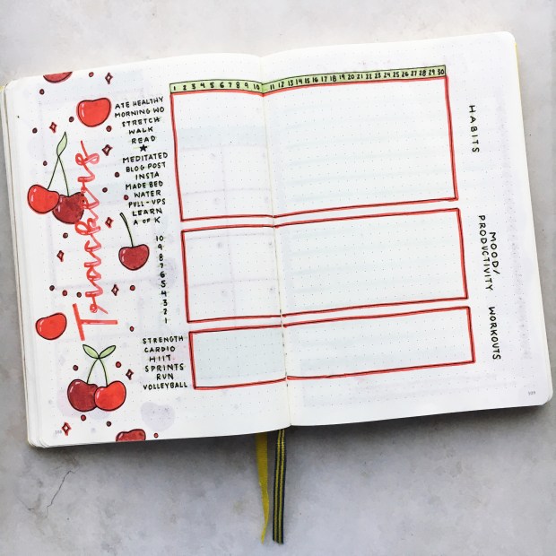
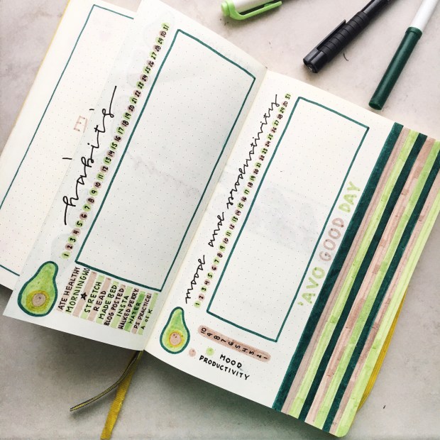
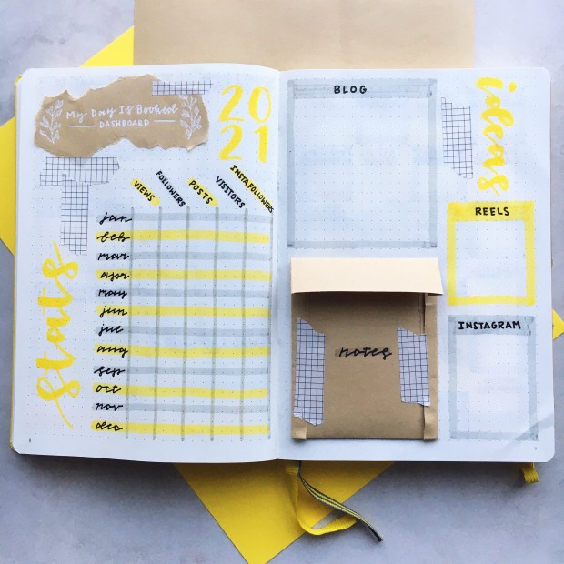
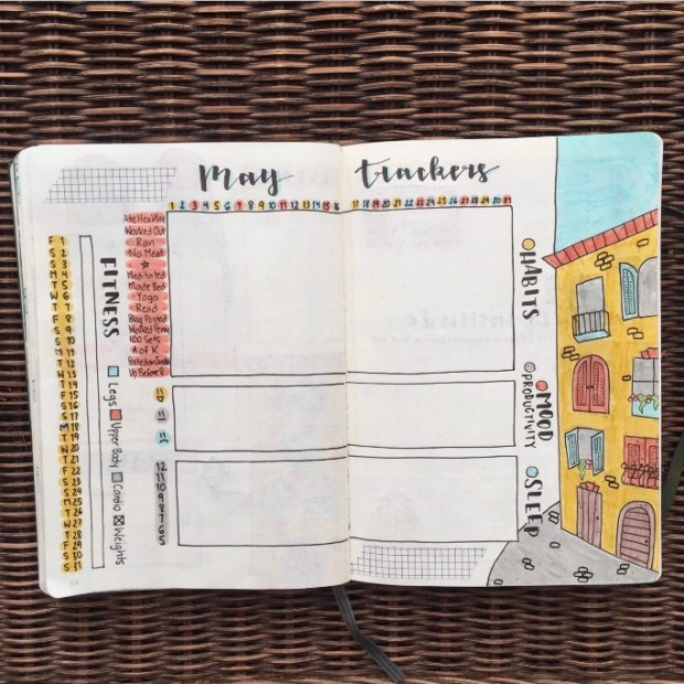
Kept my trackers and everything the same because I love how easy they are to fill out, and also how the charts and graphs look:) Although I did add another tracker to track my workouts! I drew some more cherries on the side too, and it looks so good.

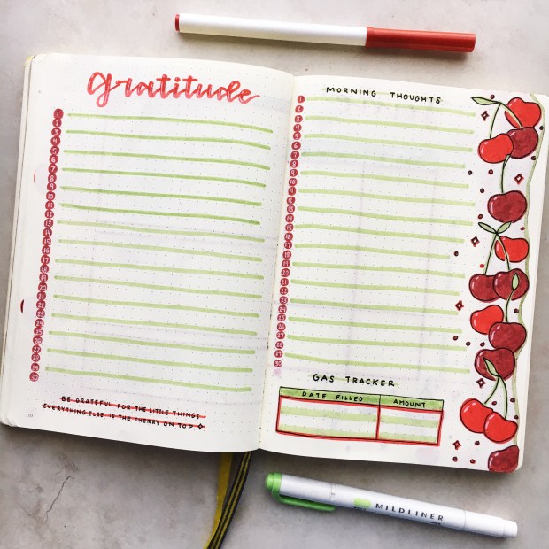
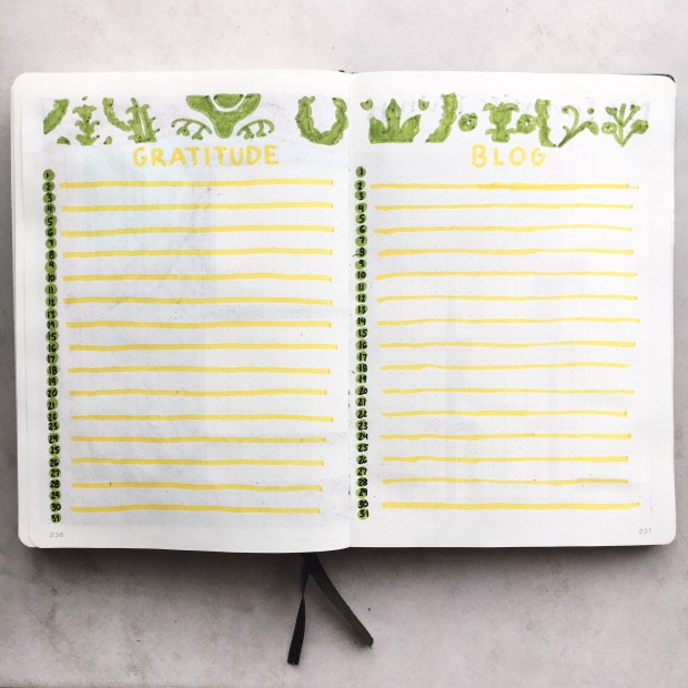
This page is so gorgeous too! It’s got my gratitude log, and then on the opposite page is a spot for me to journal a bit in the mornings. Especially since it’s so bright and nice outside in the mornings now, I’d like to start doing a bit of meditation and journaling each morning next month. Definitely a goal that I’m going to try and stick to! Underneath I made myself a little gas tracker just to keep track of how much I’m spending and when;) I cut the edge of the page around the cherries and outlined it in green, which looks cool too.

First weekly of the month! I think it came together really nicely. I outlined that curvy edge of the page in my three main colours this month, and drew in those cherries and those sparkles around the days of the week. We’ve got space to write down any events and to-dos, and also to plan my workouts. Love it!

The colours and doodles just all came together and this set-up is the perfect way to get me back into the groove. Hope you gathered some summer inspo from this post!

Yours Truly,

Olivia:))

March 2021 Bullet Journal Set-Up

I’m so excited to share this set-up! Last month I was not feeling inspired AT ALL and my Paris theme was definitely not one of my favourites. I might have to re-do it when I’m full of some more ideas. Throughout the month though, I kept going and made super simple spreads so that I could still plan out what I needed to get done.

This month I felt some of my creativity come back and had a great theme idea that was quick and easy to do- Avocados! They’re so cute and easy to draw (and also delicious), plus they’re green so it goes well for the month of March. I think the key for me moving forward is going to be keeping my themes and spreads simple but fun, so they keep me interested in bullet journaling! When I do complicated themes I feel like I have to spend hours in order to make my spreads look good, which isn’t great when I don’t have a lot of time, and can also get boring quickly.

Speaking of simplicity, I’ve also scaled my monthly recaps way back this year. Last year I did a full out scrapbook-y collage at the end of each month, with photos and quotes and a whole bunch of decorative elements. They were fun to make, but it did take a while and this year I feel like I have less time and don’t really feel like doing it. So instead I’ve just been simply writing out the name of the month in the middle of the page, throwing in a border and maybe some doodles, and just journaling at the end of the month.

Journaling is something that I want to do more of this year, so that I’m more aware of how I’m feeling and can organize my thoughts!

I absolutely love this March theme and I did some pretty cool things this month that I might continue to do for the rest of the year! The colours and doodles and fonts all work so well together, and looking at it makes me happy, which is always the goal:) Hope you enjoy!

My title page is SO cute:) I love the quote that I did and it’s so true; you can’t make everyone happy! Now let’s talk about the opposite page because I did some cool things. I cut each page this month at a different width, and then coloured in the edge, so that from the title page it looks like a bunch of little tabs that you can flip to! It turned out so well and I’m definitely thinking of doing this every month from now on. Because of this, my title page is definitely a bit smaller because of this, but I didn’t mind because I was keeping things simple anyways. This month I used my light green Zebra fineliner, my pale brown Zebra fineliner, both a dark green and a yellow Crayola SuperTip, my black fineliners and also my white gel pen.

Here we have my monthly dashboard spread, where I have a little calendar, and space to write everything that’s going on for the month. I find that I don’t use this spread a whole ton, so making it smaller was A-OK. I did give myself lots of space to goal set and write some intentions for the month down though! On the side of the right page I drew some more avocados:)

Next we’ve got my mood, habit, and productivity trackers! The pages were still a bit skinny because of my tab-making, so I oriented my trackers vertically this month. I’ll fill in the squares when I complete a certain habit, and do a little line graph for my mood and productivity. I included a couple of avocados in the bottom corners, and on the side I have a quote that says ” ‘Avo Good Day”. Love it! The colours and simple, mono-line cursive font look so nice.

This spread is so pretty! In the middle I did a horizontal strip of avocados and some polka dots, and then wrote the title of the page on top of that background. Then I numbered off the days on the side. One page is for my gratitude log, and the other is for planning blog posts!

And finally, my first weekly spread! Kept it simple with an avocado doodle for each day, a to-do section, and a great quote. Lots of room for planning, and it looks great too:) These are the kinds of spreads that I need more of!

Can’t wait to come up with some more weekly spreads for this theme- who knew there were so many good avocado quotes out there? Have fun setting up your own March spreads!:))

Yours Truly,

Olivia:))

2021 Bullet Journal Set-Up

Hey guys! Hope you all had an amazing holiday!! I’m really excited for today’s post because it’s my 2021 BULLET JOURNAL SET-UP!!!!! I received a new bullet journal for Christmas and had so much fun creating my spreads for the new year. Opening up a new journal is always so satisfying, and I can’t wait for the fresh start that this journal is going to help me with in 2021✨

If this is your first year bullet journaling, a bullet journal is basically a planner, diary, mood and habit tracker and scrapbook all in one! I go a bit more in depth about what bullet journaling is all about in my very first set-up in 2018, and I also have a whole post on How I Use My Bullet Journal which is very helpful if you’re just starting, so be sure to check those out:) Plus, if you’re looking for more inspiration make sure to take a look at my 2019 and 2020 set-ups as well:))

This year I’m using a Leuchtturm 1917 journal for the third time because I really love the quality; it’s hardcover, has numbered pages, a pocket at the back, and it’s not too expensive! This is also the only journal I can find that has at least 240 pages. I like to give myself 20 pages per month and be able to fit the whole year in one journal, so the amount of pages in the Leuchtturm 1917 is great🙌 For 2021 I chose their Lemon yellow colour🥰 It’s pretty bright, but yellow is one of my favourite colours and I thought that it would bring some positive vibes into this year which we all need!

I know that lots of people like to keep their beginning-of-the-year spreads pretty neutral, but last year I brought in some olive green because my journal was an olive green colour, and it looked really good. So this year I decided to use some yellow in my 2021 set-up and I love how it turned out!! I paired it with a nice light grey. Actually yellow and grey are two of the Pantone colours of the year as well, so look at me go! As is hinted at by the cover of my journal, I used a lot of brown kraft paper in these spreads as well, and wrote over it with a white gel pen. I got a whole roll of this stuff on Amazon for like five bucks and it was TOTALLY worth it- it looks so good! And then I also used some washi tape because the one I have is neutral and it’s a great way to fill in empty space. The markers I used throughout this spread were a bright yellow Tombow Dual Brush Pen in the shade 055, a light grey Zebra Mildliner, my Faber Castell fineliners, and my Sakura Gelly Roll 08 gel pen.

On the inside cover I glued in some simple little spacing cheat sheets. These are great for when I’m making any sort of spread and need to know how to divide up the page without doing the math or counting every single time. There are some great resources on how to use a whole page to make a more elaborate cheat sheet; I love AmandaRachLee on Youtube! But I like this simple and I don’t feel like I need to use up a whole page for it. I decorated with a cute little olive branch motif on that brown kraft paper, which is something you’ll see me use a lot throughout this set-up!

Then on the opposite page I wrote out my name and contact info, and a little quote/personal motto:)

This journal also comes with a pre-made index, which is really nice! I don’t keep track of every single page in my journal, but I did write out which pages I’m using for which months. I wrote out my own title, and I love the way that the yellow and grey work together! There is still some space on those grey lines to keep track of more spreads if I want to. There were two more pages that had indexes on them, but I think I’ll just either glue those together or leave them blank.

Here’s page 1 in my journal! I did a nice 2021 title page with a border of kraft paper that has some of those olive branch doodles on it. I wrote out 2021 in a simple, yellow font, and then actually wrote out the words twenty twenty-one as well. On the opposite page there’s my key. I pretty much kept the same key as last year because I found that it works really well for me! But there are so many options that you can use when it comes to bullet shapes and pen colours to differentiate between tasks and keep you organized. I used a stencil to draw out a key on that kraft paper for decoration as well.

This next spread is my future log! This is where I write down all the events that are coming up for the year; like birthdays, future appointments, or exam dates. The little calendars I drew out are also helpful when I’m setting up my monthly spreads. This year I was inspired by AmandaRachLee to try something really cool. I cut the edges of the page in between two spreads so that it’s like a little door that you can flip back and forth. This way you only have to write out one title, and it also makes the whole thing feel more cohesive because instead of splitting this between two spreads, it’s like it’s only one spread. I used kraft paper for those olive branch doodles, and also to write out the calendars. This spread is super functional and super cute- which is great combo when it comes to bullet journaling!

Next up is my goals/”this year” spread. I drew out a big 2021 in the centre on kraft paper, which I LOVE. On the left side I have some boxes to write down my goals for the year, which I split into school, fitness, blog and personal. Then on the right I have a space to do a bit of journaling before the year begins. I wrote some prompts that will help me to get focused on what I want to achieve this year. It’s great to have some goals to work on over the course of the year- whether you’re using a bullet journal or not. I love these pages so much and can’t wait to fill them in!

This spread took me a while to figure out because I knew that I wanted some sort of blogging spread at the beginning of my journal, but just didn’t know what that would look like. But now that I’m finished I’m so so happy with the way that this looks! I wrote out “My Day Is Booked Dashboard” on that kraft paper and used it as a tile, and then wrote 2021 in yellow beside that. Beneath the title on the left page, I have a chart where I can track all of my blog and Instagram stats. Last year I tracked these monthly in my monthly recaps, but because I was often behind on those monthly recaps I couldn’t get an accurate count of my Instagram growth. So this will allow me to write down everything right away. Then on the next page I have lots of space to write down both blog and Instagram ideas, and I made such a cute little envelope out of my kraft paper to hold any extra notes that I might have! Maybe I’ll do a tutorial on Instagram reels on how to make one! I’ll write that down in my ideas section:) Even if you don’t have a blog, a page like this can still be very helpful for work or school. Make it your own!

These are the last two pages of my set-up:) Of course I had to include a 2021 reading challenge- I enjoyed the one I did last year so much! I’ll have a whole other post dedicated to this coming out soon. Then on the opposite page I wrote out a quote, because I love to have one to start off the year. My quote this year is “What the New Year brings to you depends a lot on what you bring to the New Year.” This really resonated with me because it reminds me that it’s important to have a positive attitude, work hard and give it your all! I did another of those kraft paper borders to surround this page.

And that concludes my 2021 Set-Up!! I’m so excited to fill all of these spreads in, and I love how they make me feel ready to take on the world in 2021. I hope that you found some inspiration in this post and that you have fun setting up your own journal! Don’t forget to check out my past set-ups if you want to see more spread ideas, and feel free to ask me any questions you have about bullet journaling! Stay tuned for my January 2021 Set-Up coming up soon:))

Yours Truly,

Olivia:))

**BULLET JOURNAL GIVEAWAY!!** + My Favourite Bullet Journal Spreads of 2020

Hey guys! I’m so excited to announce my first ever giveaway!!

Leuchtturm 1917 Canada very kindly sent me one of their beautiful journals to giveaway to you guys! I’ve been using a Leuchtturm 1917 journal for the past two years now, and the journal that I’m planning to use next year is a Leuchtturm as well. I love them so much because of the quality and all of the features that they have. Their dotted notebooks have a pre-made table of contents, an elastic band for closure, numbered pages, and a super handy back pocket! They’re also one of the only journals that I can find with over 200 pages, which I need because I like having just one journal for the whole year.

The specific journal that I’m giving away is a gorgeous emerald colour and was a collaboration with the founder or the Bullet Journal system, so it has BULLET JOURNAL embossed on the front and comes with a bullet journaling guide! It’s absolutely amazing and great for both a first time and veteran journaler.

I’m also including a set of Tombow Fudenoske Brush Pens (these were not sent to me by Tombow), which are my favourite pens to use in my journal, as well as a MyDayIsBooked bookmark, and some super cute washi tapes! So this is perfect if you’re looking to start your first bullet journal this year!

This giveaway will be taking place on Instagram, so make sure that you check out my Instagram page for all of the rules and instructions on how to enter!

Moving on with my post… I wanted to look back on some of my favourite spreads from 2020! I did such a range of styles this past year, and I love to see the progression that I make with my writing, doodles, and different spreads that work for me at different times. Also something that struck me when looking through these was how my photography evolved- I really want to scream at my January 2020 self for having sucky lighting and not showing my journal off to it’s full potential! I kept the same photos in here from when I actually made the spreads, so that picture-taking journey is on display here as well.

I love that I found out a lot about what I absolutely need to have in a journal this year. That’s what’s so great about bullet journaling as opposed to having a pre-made planner; you can totally customize everything, and all of your essentials are in one place! If you haven’t already, defintely experiment with different spreads. The only way to find what is the best for you is if you go a little out of your comfort zone!

Here are some of my favourite spreads from 2020:))

This is my favourite weekly spread from January! This is the month where I did sort of a 1920’s art deco theme, which was a kind of style that I’d never really done before. I love the combo of the gold and black, and how much space I had to plan in this spread. I’ve realized that planning space is a number one priority for me! I also love how the quote came together at the top- I glued in some pieces of paper here for a more scrap-booky look.

I just LOVE this February title page. It’s so simple and clean yet so elegant! I want to do more things like this in my 2021 journal because I feel like I’ve been going a little heavy on the detail and the drawing lately. I love the quote, cute borders, and colours on this page. Plus my calligraphy is pretty good:)

March was a fun month! In my journal at least; I know that March was the time when we really got hit with COVID stuff. This was the first time that I went with this more graphical tracker, and I actually stuck with this style for the rest of the year. I love the way that the plants are coming out of the side! On the left side of the spread I did some really nice habit trackers as well. I’m not a huge fan of that style of tracker functionality wise, but I like the way that it looks.

May was one of my favourite themes this year, and this is definitely one of my favourite tracker spreads of all time. Just the way that everything looks together, from the illustration to the boxes to the font, is so good! It’s the first time I tried this layout and I absolutely love it; I stuck with it for the remaining seven months of the year. So yeah, totally in love!

Here’s another spread from May because I just love it so so much. My font and the design of the page for my gratitude log just stands out so nicely! And on the opposite page I did a Crash Course episode tracker. The logo turned out really well:))

This spread was great for some mid-year reflection! My quote is so pretty and it’s a really meaningful one too. It went hand in hand with my word for this year, which was flourish. I kind of fell off the track of writing about my thoughts and feeling, which is something that I want to do more of in 2021 because it helps me assess where I’m at and what I need to be doing better.

This is another candidate for my favourite tracker spread!! The drawings are so cute, and I love how the colours go in and out of the black border. Again, just something about how this spread looks just makes me happy! Anne of Green Gables was such a great theme.

August had such a pretty title page! The colours worked so nicely together, and I was totally getting Mediterranean tile vibes. I love the patterns and how simple yet beautiful it is! My quote for this month was really inspirational too- all about giving 110%.

October was a lot of fun to do because of the contrast between the black and white! Something cool that I included this month was a moon journal, where I did some reflection based on different phases of the moon. It was a really unique and interesting spread! I love incorporating pages like this because it breaks up the repetition of having the same spreads over and over.

This full-page title page is gorgeous! It’s so nostalgic for me because I love watching The Sound of Music every year. It was really drawing heavy, so I kind of want to do some simpler spreads soon, but I do love the way that it turned out!

My Advent calendar spread is so cute, and was inspired by the song “My Favourite Things”. In each pocket there’s a little self-care task or act of kindness to complete. I’ll be honest, I haven’t been the best at keeping up with this! But I still love all of the doodles and how I wrote out the lyrics at the top.

Those were my favourite spreads from the past year! I’ll see you guys tomorrow with a delicious recipe! In the meantime, don’t forget to check out my Instagram page and enter my giveaway!

Yours Truly,

Olivia:))

December 2020 Bullet Journal Set-Up

Hey there! This post has been postponed a couple of times but I’m glad that I’m finally getting it up! It’s my last set-up of the year which is both crazy and a little sad. For me this year kind of zoomed by, and while it was really weird and I’m excited for 2021, I still made some good memories in 2020. It was a good year in my bullet journal too!

My bullet journaling style went through a big progression this year:) I did some straight up doodle-y themes, but I also branched out and went with a lot more drawing and colouring! I did tons of experimentation and found a bunch of layouts that I really like. I’m sad to leave my olive green journal because I love the colour so much, but I’m going to leave you guys to speculate about what colour I’ll be getting next year:) I’m brainstorming ideas for my 2021 set-up already though, and I’m super excited for it! That’ll go up at the end of the month.

Setting up my spreads for December was a bit of a struggle, to be honest. I found a great theme which is near and dear to my heart- The Sound of Music! I watch this movie with my mom every Christmas and there’s a lot you can do with it drawing-wise, so I thought that it would work perfectly. For some reason I just couldn’t really transfer my ideas on to paper though. I didn’t want to do a ton of drawing because it can be time consuming, but I didn’t really know how to otherwise fill up the page. So this theme isn’t one of my best, although I have a few cute pages and I really love the concept. That darn bullet journaler’s block just got in the way I guess!

It’s all good though. I think you’ll enjoy my fun drawings and the advent calendar that I included again! I’ll explain more about how that works later in the post. Hope you enjoy my last set-up of 2020!

For my title page I did end up doing a lot of drawing/colouring, but I’m not mad about it because I think it turned out really nicely. I was inspired by one of the beginning scenes in the movie, which is also one of the cover photos for the DVD. I drew a mountain scene from Austria, and then Maria singing in the field. I did my title in yellow which I don’t think I’ve ever done, and my quote is directly from one of the songs in the movie. Super cute!

Here’s where I kind of ran into my dilemma. I didn’t want to draw out a whole scene again because it takes so long, but I didn’t know what else to draw! I ended up going with some Edelweiss, which is a mountain flower and the tile of a song in The Sound of Music. I drew a flower, wrote some lyrics from the song, and that was that. I can’t really decide if I like this full page calendar layout or the smaller, half page one, but I went with a full pager this month. Also I got new Tombow fudenoske brush pens recently and I’m kind of “breaking them in”, so I feel like my calligraphy wasn’t that nice. I don’t know I just wasn’t really feeling it with this one but they can’t all be great I guess! (I’ve wanted to use the laughing face emoji like 50 times in this post but I can’t because I’m writing it on a laptop.)

One of my favourite spreads of the month for sure! In the movie they have a puppet show with goats and goat herders, so I tried to recreate that for my trackers. Although I just drew a goat puppet because I can’t draw people, even in puppet form. (See, another good opportunity for the laughing face emoji). I did some theatre curtains, a mountainous background, and a cute lil’ goat puppet. You can’t really see but I have all my habits written out on the side, as well as space to record my mood and productivity, and my workouts.

I also feel kind of meh about this spread, but it is what it is! I was going for the pattern on the play clothes that Maria makes for all of the Von Trapp kids, and it turned out alright. I balanced out the green with yellow font, and then highlighted every other line so I can differentiate them more easily. Just a simple spread to write down the things I’m grateful for, and to plan blog posts:)

We’ve arrived at my advent calendar! I love it:) I made 25 little pockets by cutting out rectangles of white paper and sticking then down on 3 sides with my roll-on glue tape thing. I drew a bunch of things from the “My Favourite Things” song on them, and they’re super cute! I then wrote down 25 things to do on other little pieces of paper, mixed them up, and put them in the pockets randomly so I don’t know what I’m doing on which day. This year I included acts of kindness in there, like doing an extra chore or cooking for my brother, and some of my favourite things, like having a smoothie bowl for lunch or having a good stretch. I completed this page by writing out some of the favourite things in cursive on brown paper, and also including a title:)

And finally my first weekly of the month. By the time I got to this spread I was pretty tired and I rushed it a bit, but it’s still cute! I just divided the page into five sections, and drew some mountains on the opposite side, with a to-do list.

There’s my December Set-Up! Stay tuned for my 2021 set-up coming later this month:)

Yours Truly,

Olivia:))